Print & digital Collateral


Keys to effective branding
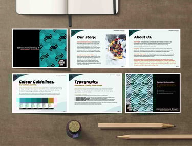
The key elements of effective branding are consistency, clarity, and emotional connection. Consistency ensures the brand is recognizable, clarity communicates the message clearly, and emotional connection builds trust and loyalty with the audience.
Whether it's video content, printed signs, merchandise, a car wrap, an illustration, an email campaign or any other collateral, consistency, clarity, and emotional connection are crucial. Every touch-point matters in building a cohesive brand identity that resonates with your audience.
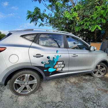
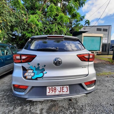
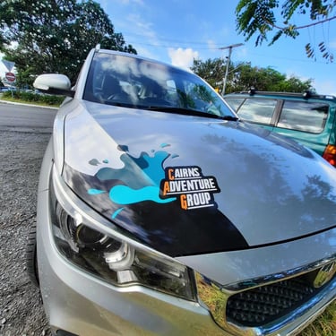
Subtle and professional Marketing car wrap design
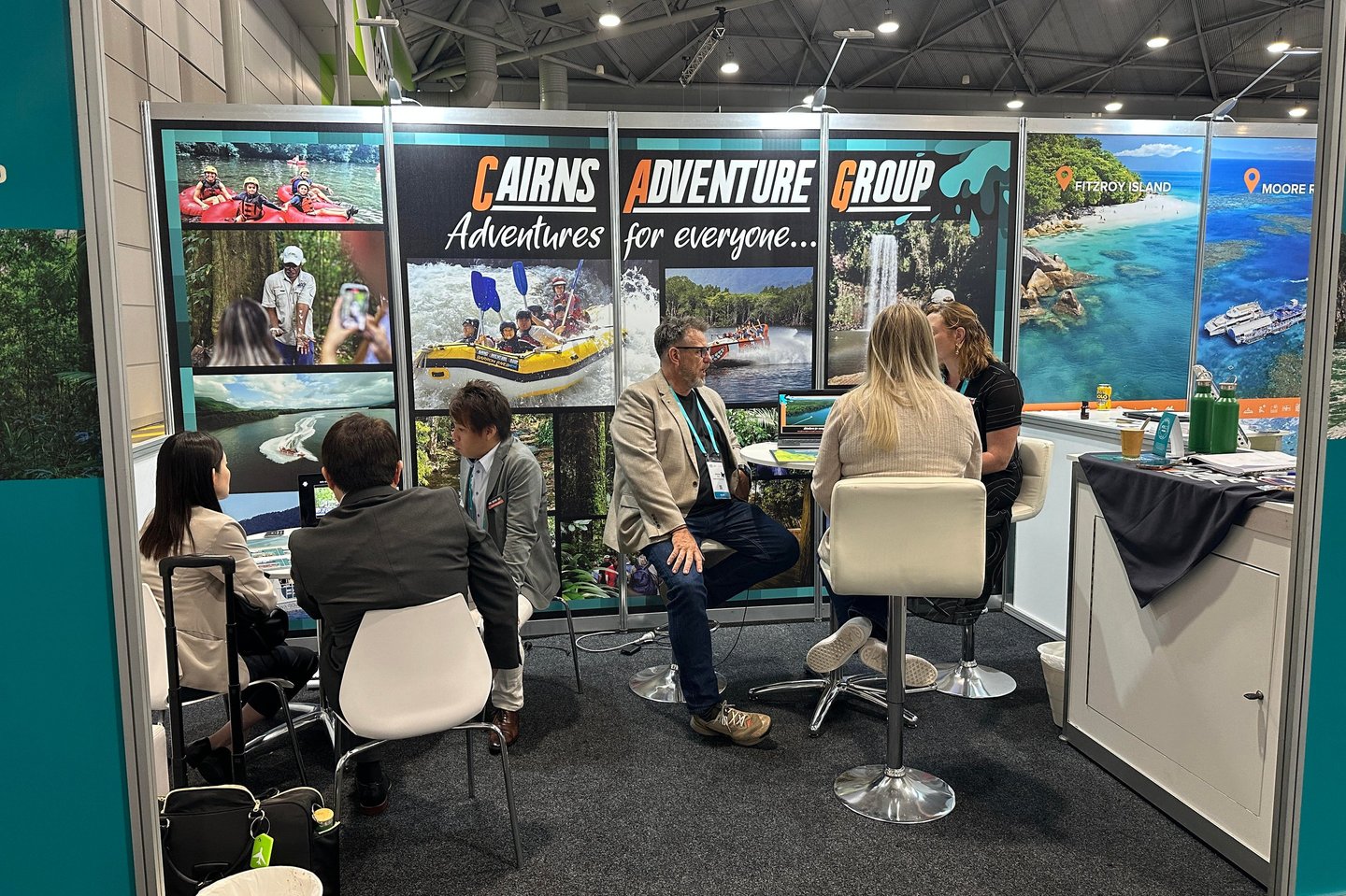
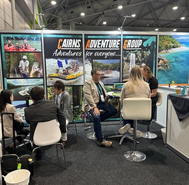
Australian Tourism Exchange - ATE - Booth Design
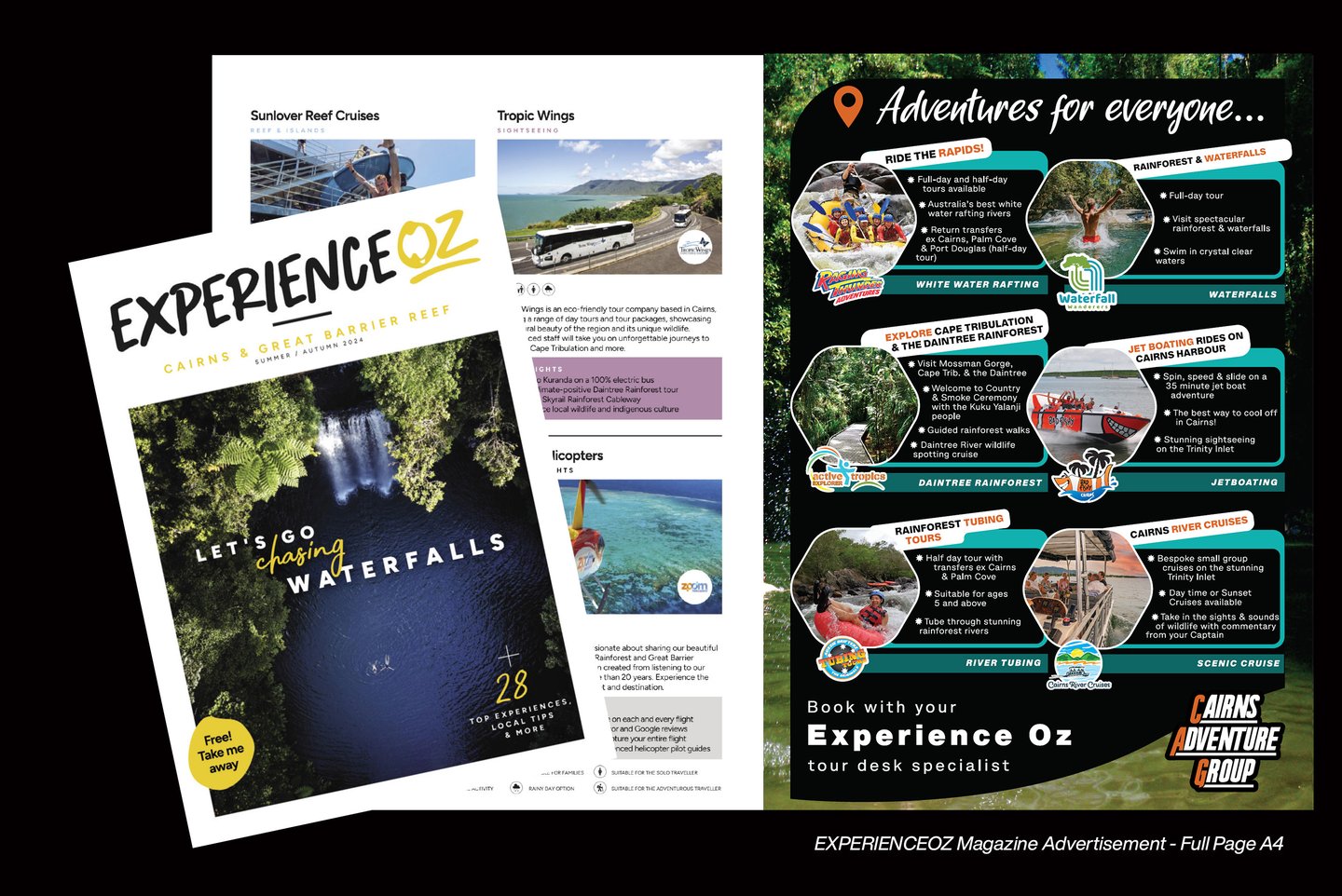

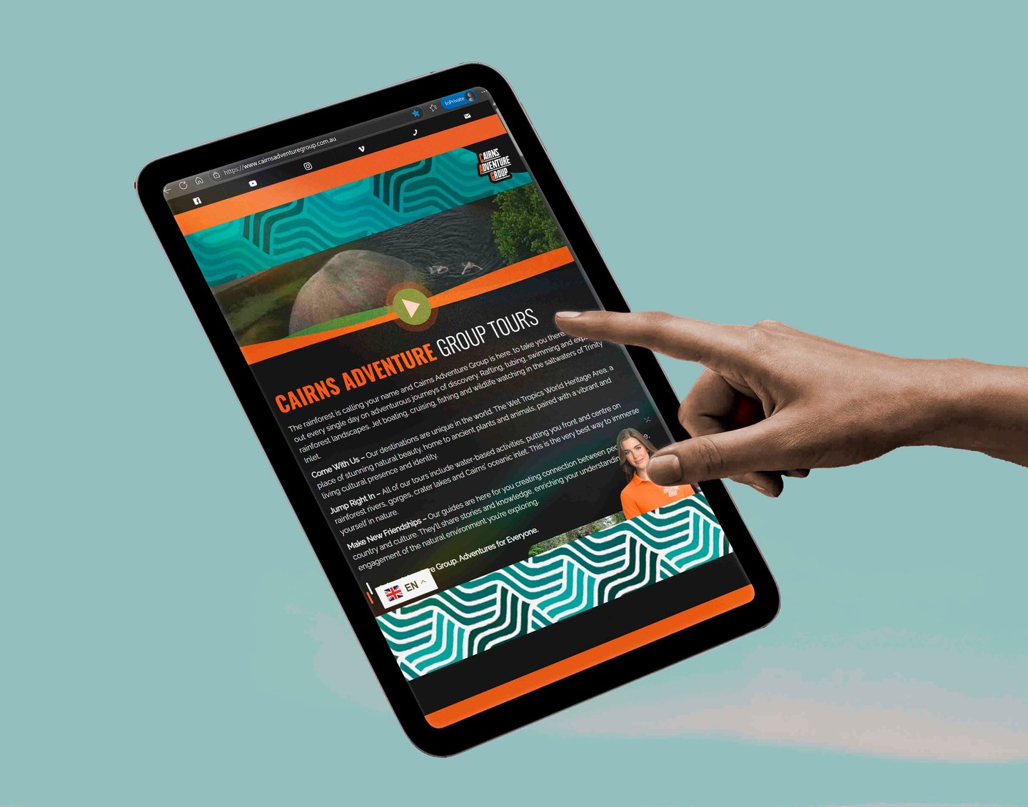
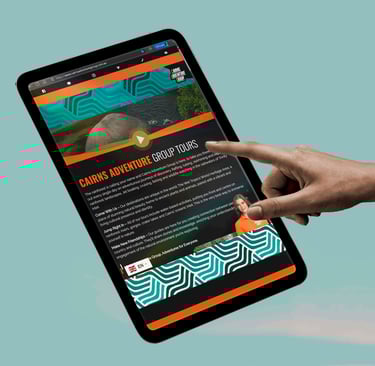
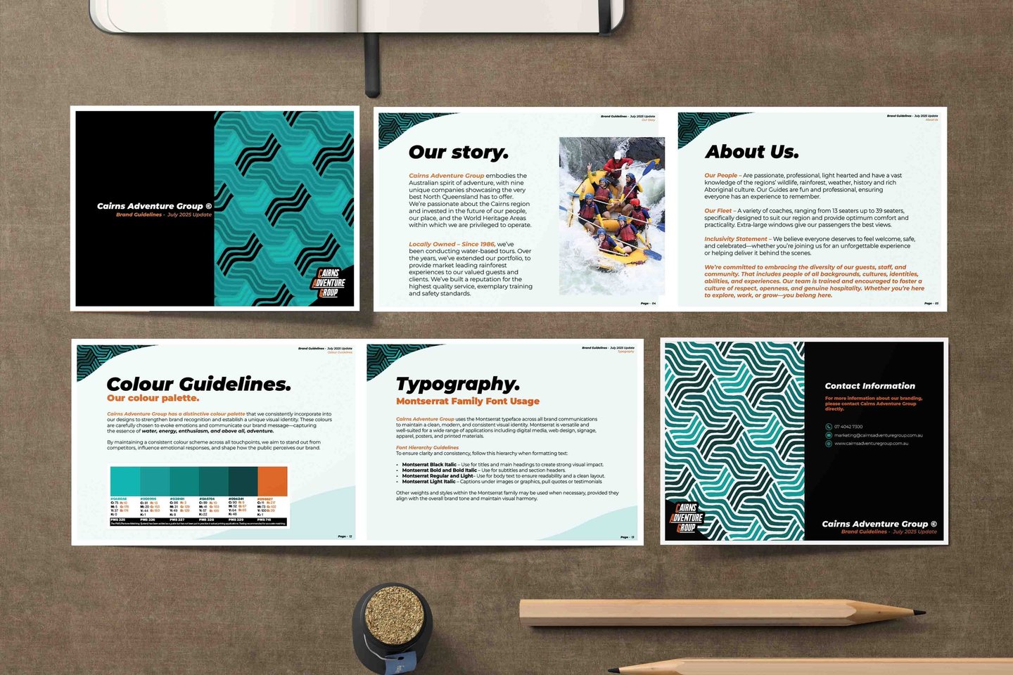
Sometimes, as with Cairns Adventure Group, multiple brands operate under a single umbrella. Each brand can have its own distinct personality—and that’s perfectly fine. What matters is that the parent brand maintains a clear, cohesive identity strong enough to unify and support all the sub-brands.
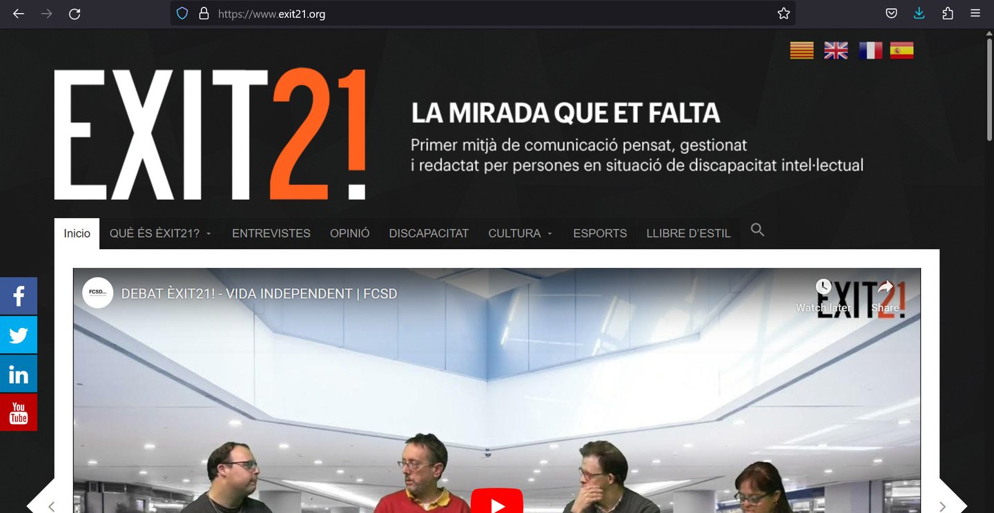
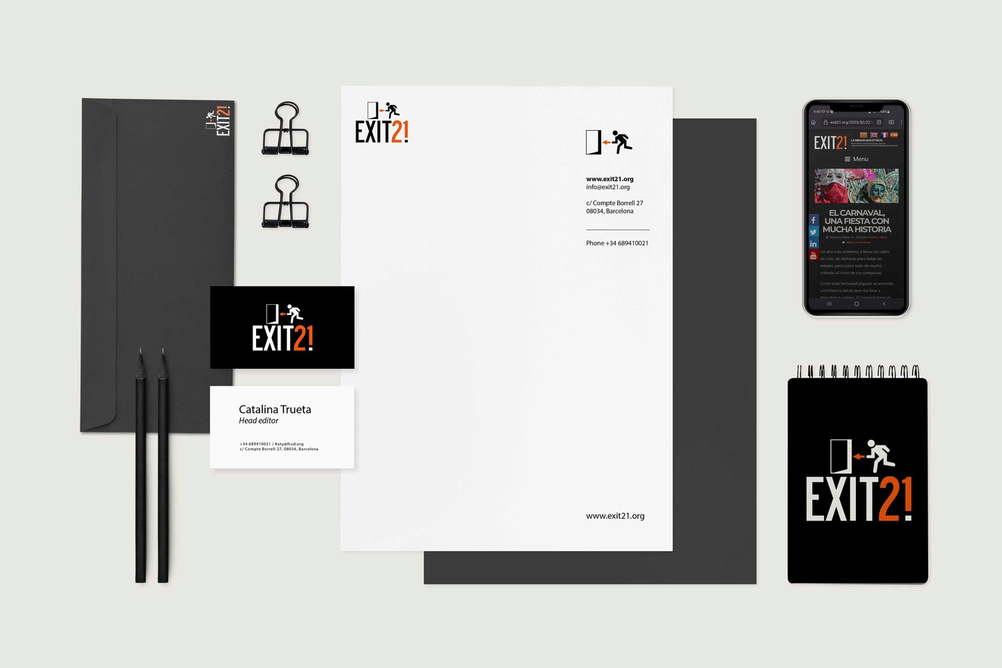
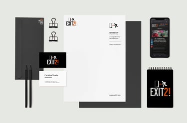
Èxit21 is an inclusive online magazine by the Fundació Catalana Síndrome de Down (FCSD), created and led by people with intellectual disabilities who share their voices through journalism, interviews, opinion pieces, and culture. The name blends “Èxit” (success, opportunity) with “21”, a nod to the 21st chromosome that defines Down syndrome—together symbolizing voice, identity, and potential. In developing the brand identity, I solved the challenge of visually uniting these two concepts by crafting a design system that is both bold and accessible, reinforcing the platform’s mission of inclusion through clarity, warmth, and strength.
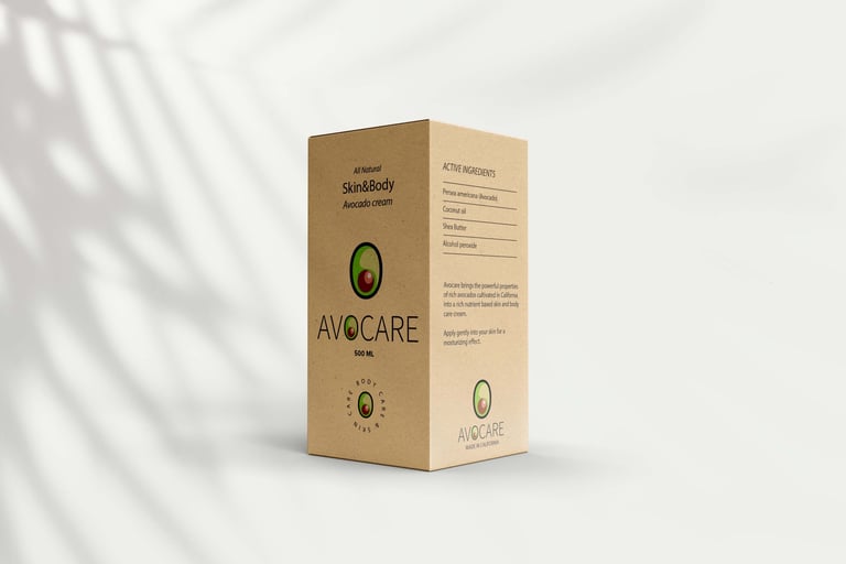
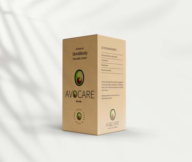
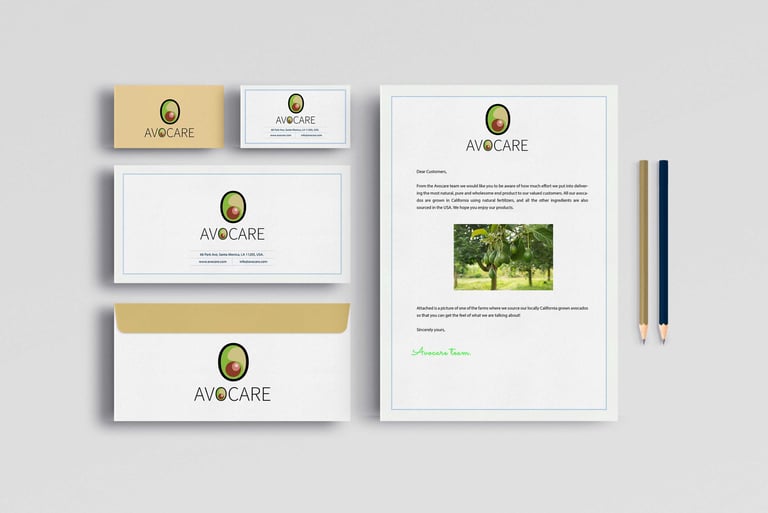
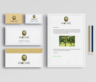
Brand development for Avocare, a Los Angeles-based natural skincare line made from avocado-derived ingredients.
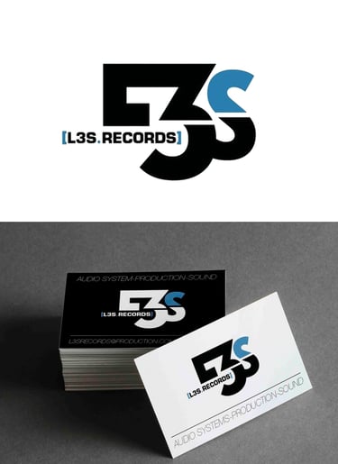
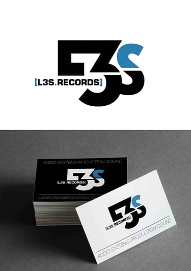
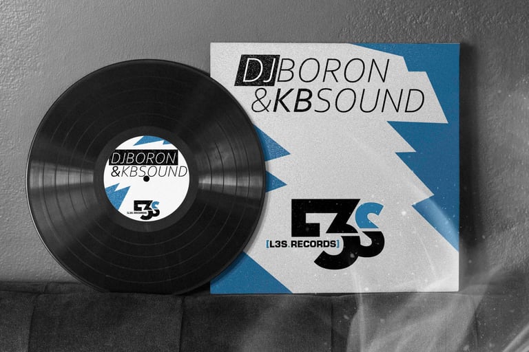
L3S Records branding – a Barcelona-based music label that blends everything from hip-hop to cutting-edge electronic fusion.
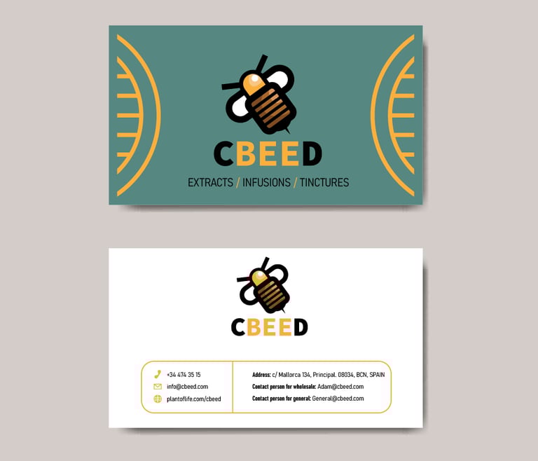
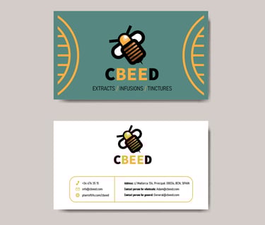
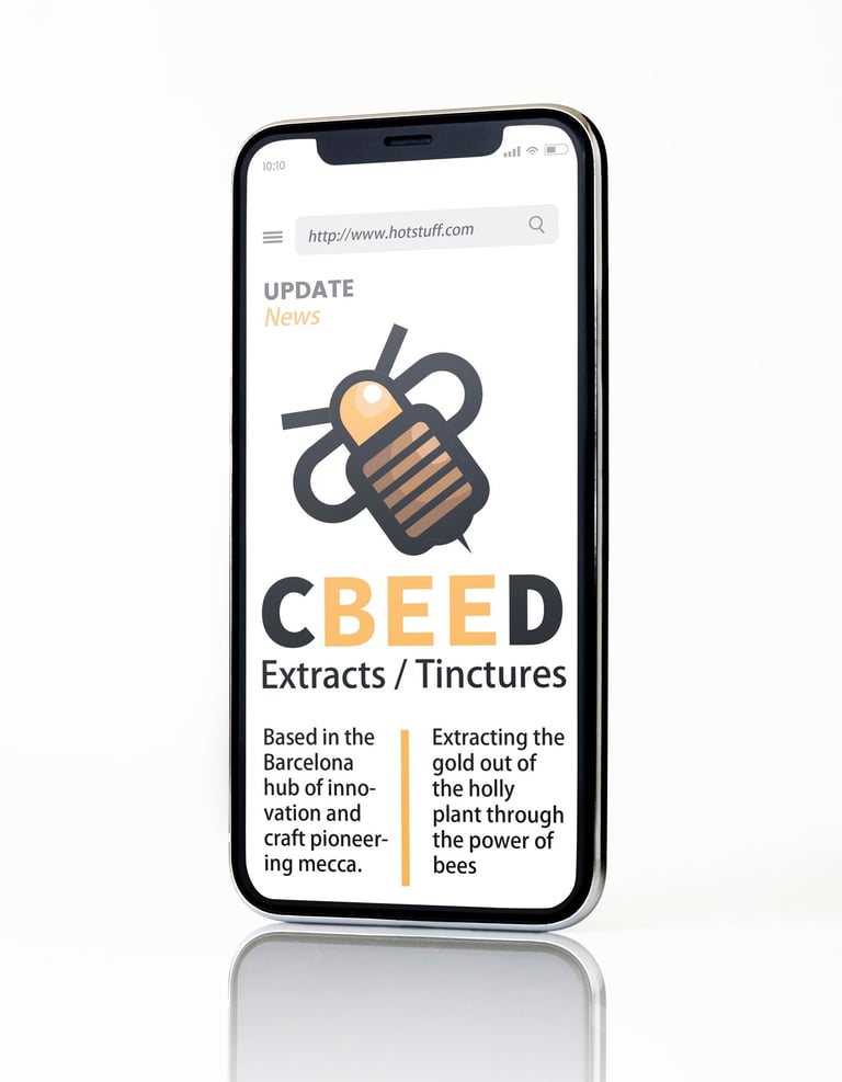
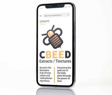
CbeeD is a medical cannabis startup focused on developing cannabis-derived beauty and wellness products. Their innovative approach includes using honeybees to extract pollen from cannabis plants to create unique CBD honey. The branding was a fun, creative challenge that captured their experimental spirit.
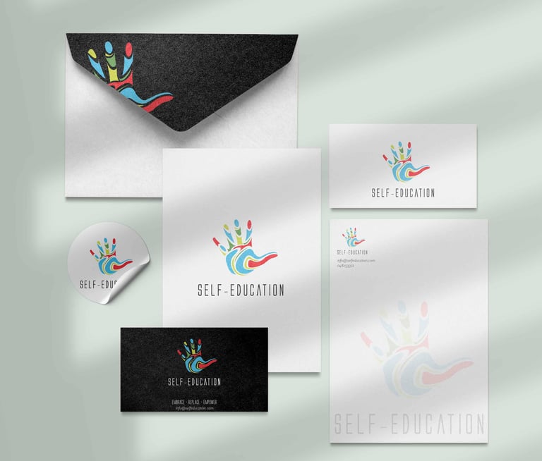
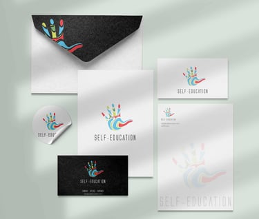
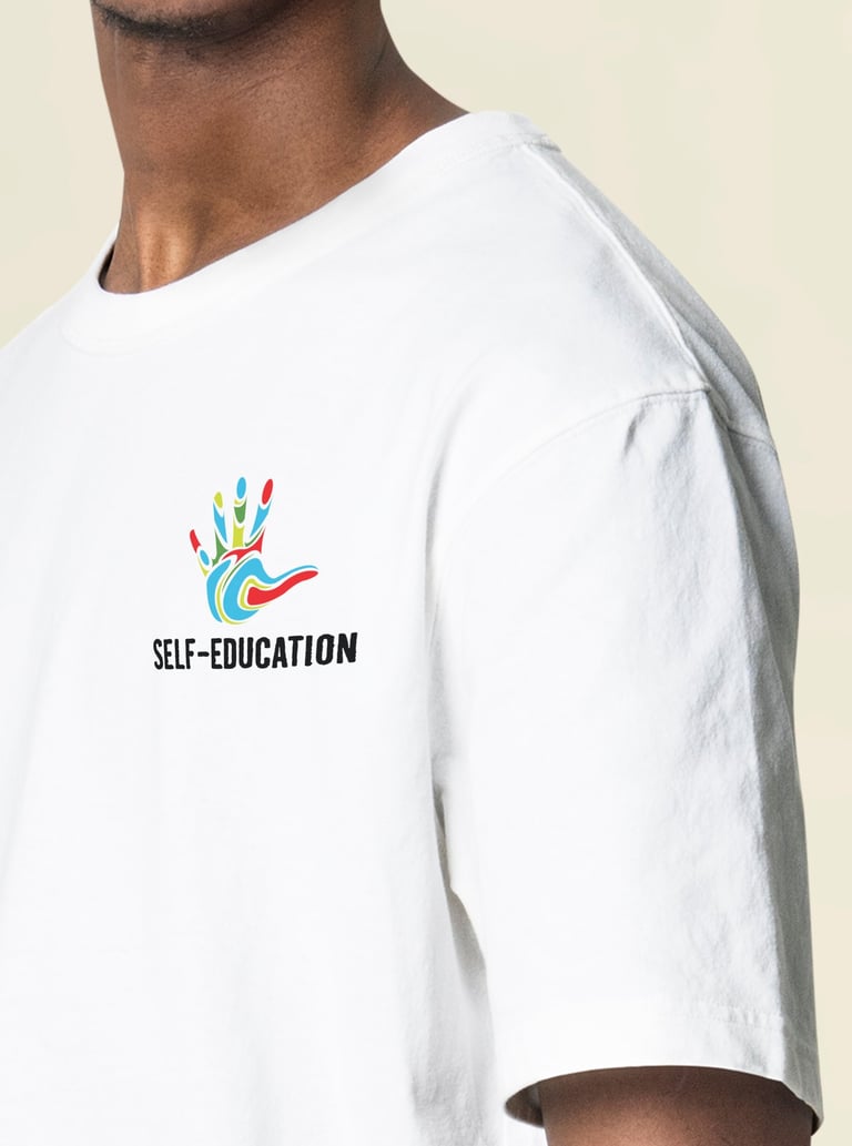
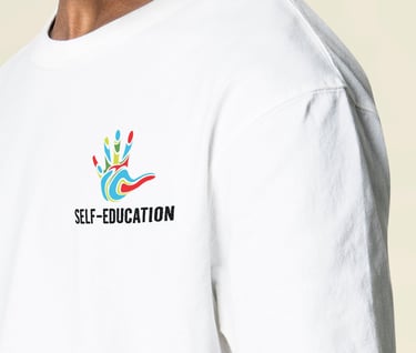
Self Education was a nonprofit startup dedicated to empowering underprivileged youth by providing access to educational resources and opportunities for personal growth. The logo's hand symbolizes warmth, connection, and the human touch that guides and supports these young individuals.
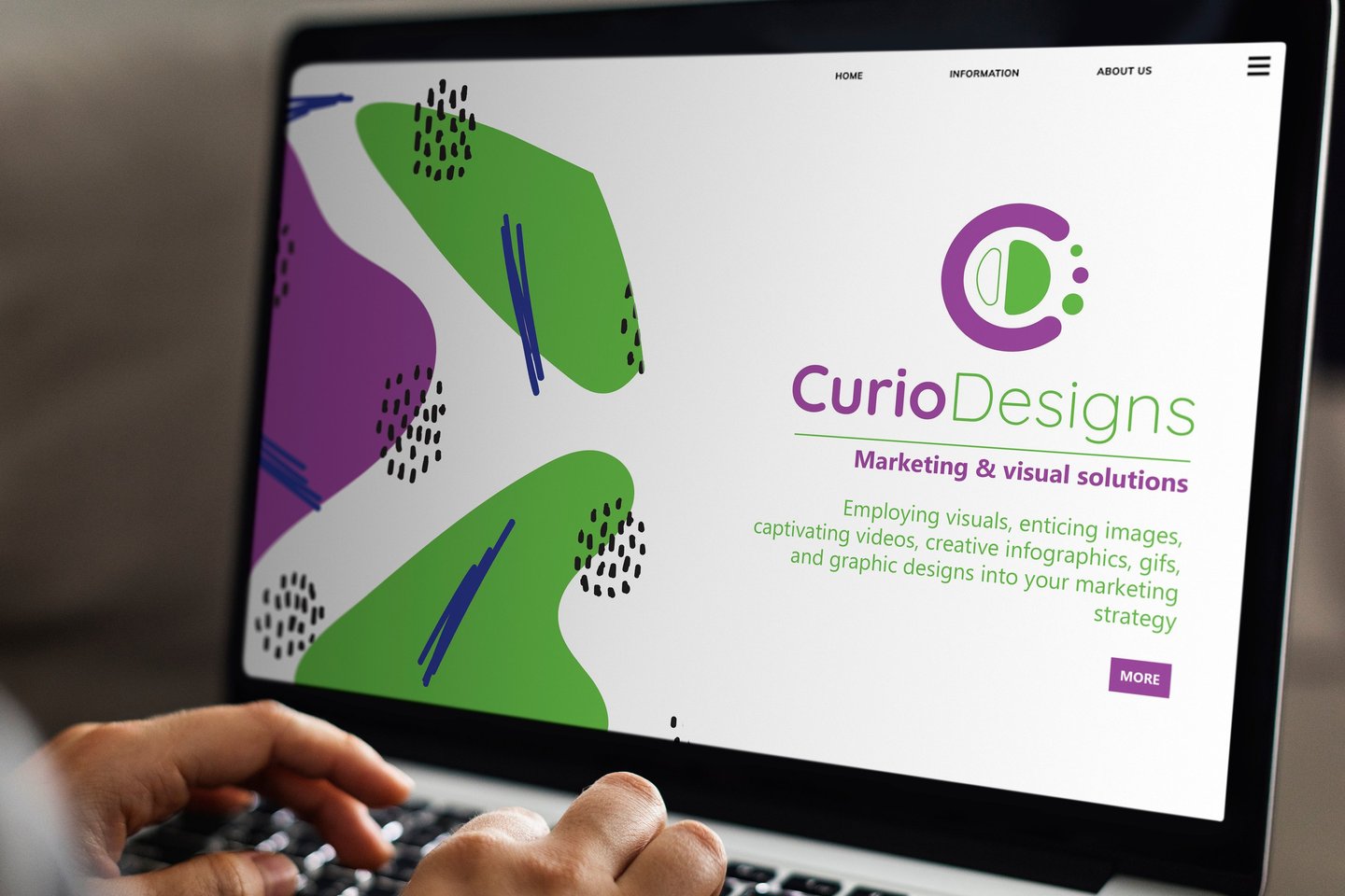
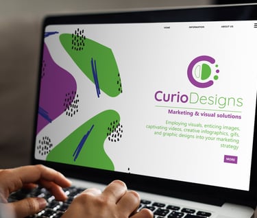
CurioDesigns: Branding for a marketing agency focused on enhancing the digital presence and communication strategies of businesses.